DESIGN MANIFESTO
Objective
Create my own personal ‘Designer's Manifesto’ which included designing the page layouts, accompanying assets, and original text. The imagery and design should be personalized and mirror my own philosophies that are written in the copy.


The Sketch
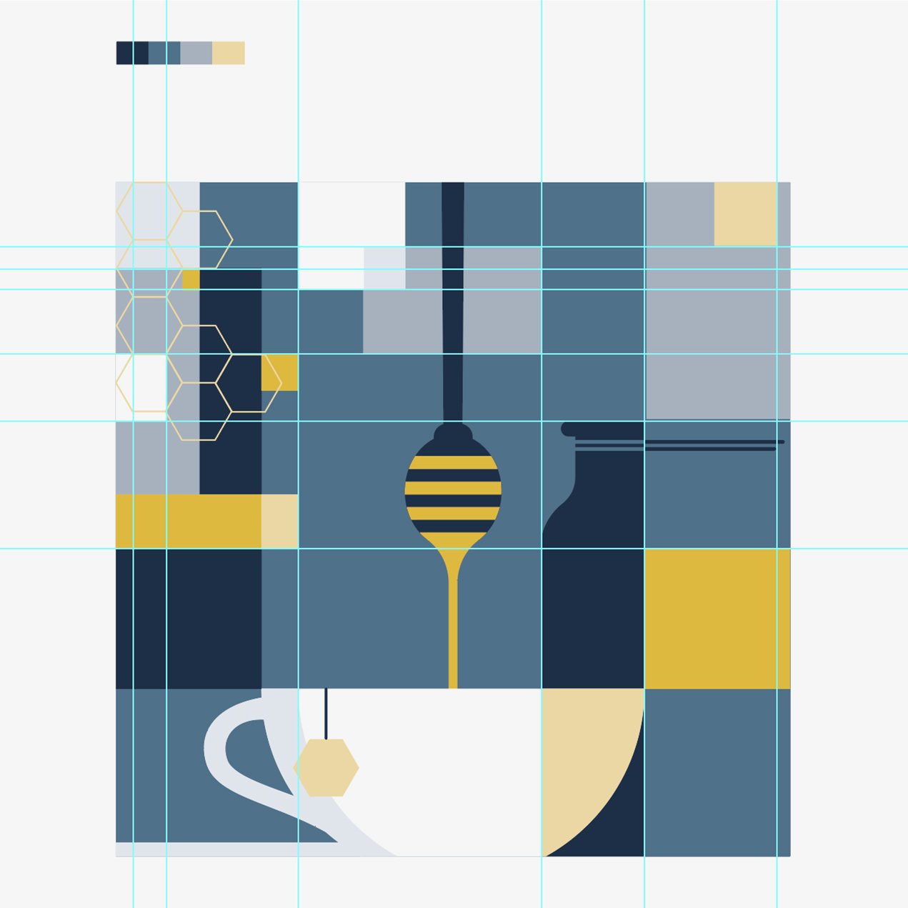
I created several sketches while I was in the ideation phase of my pages, but landed on this particular one (middle image above) because I was very attracted towards the geometric shapes. As someone who has loved and played video games since the early 90s, creating this sketch reminded me of myself as a young boy who would doodle across pages of printer paper creating my own pixelated level designs of my favorite titles. It was personal to me. I also felt it was visually appealing and had elements that could look beautiful throughout the spreads.
As I moved to sketch out what the cover might look like, I wanted the illustration linked the title of my manifesto, “Infuse.” Furthermore, I wanted my concept to act as a another personal connection, which is my daily consumption and love for Earl Grey tea, milk and honey—a “London Fog” if you will.
This retro-style design influenced by pixelated graphics and tea inspired the use of shift-complimentary colors that included a palette of muted greys, blues, off-white and honey-yellows. These color tones gave unique contrast that was pleasing to the eye, enough so that it could be spread throughout multiple pages.


Layout and Refinement
Using multiple grids, I was able to fit elements into perfect placements so that they aligned with other elements in my layout. I also gave myself the freedom to '“break” those rules as I saw fit.
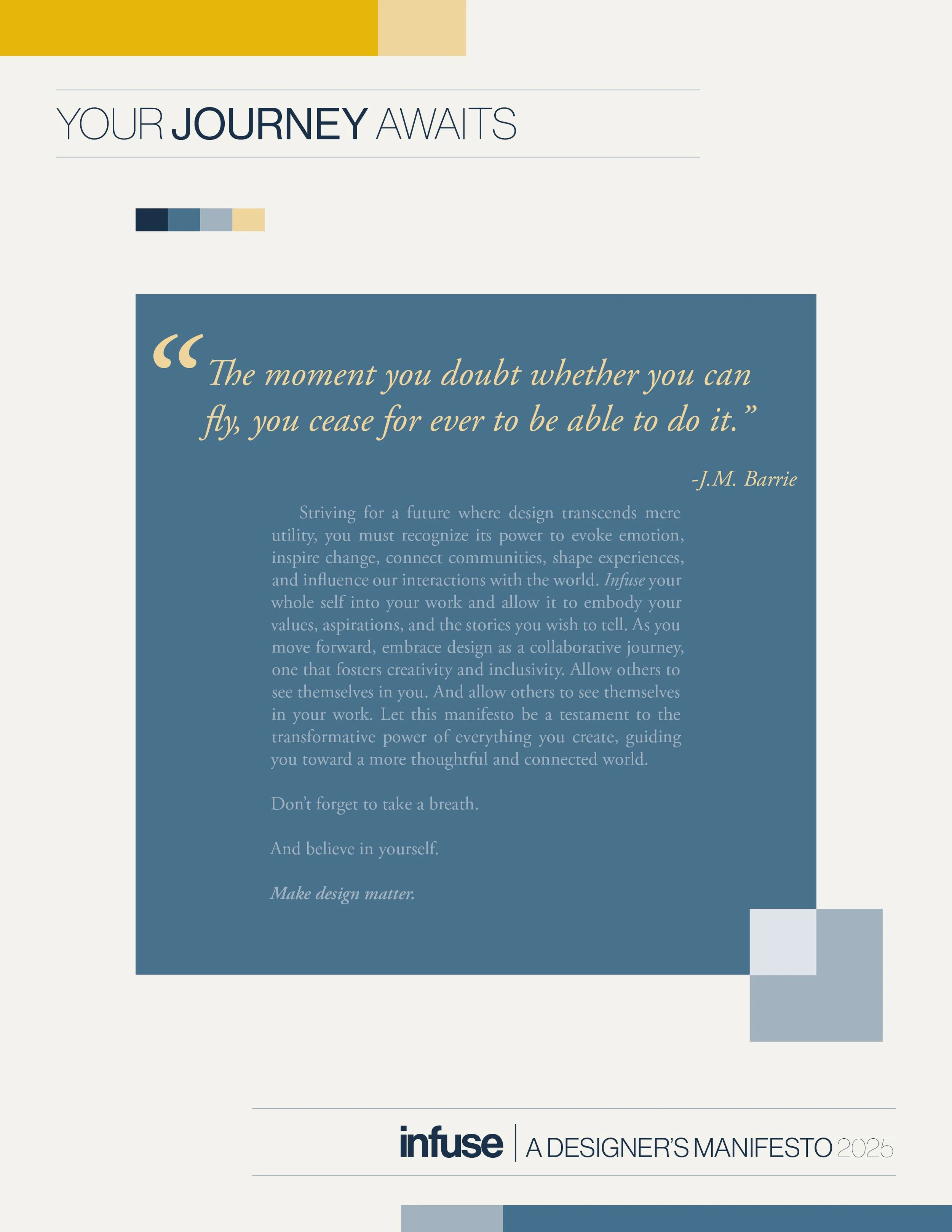
I used the geometric block shapes to form similarity, repetition and unity throughout the booklet. The hexagons from the front page are used sparingly. There are lines that guide the reader from section to section, and I also used the color yellow to guide the audience’s eyes across the page or to the next. The block quote in the center spread, as well as “stay curious”, and “listen & adapt” across second spread are taken directly from my text for aesthetic and design purposes, and to highlight the message. The drop caps in each section paragraph together spell out “DESIGN”.